; Date: Sun Apr 14 2019
Tags: Mobile-friendly web design »»»» Mobile accessibility »»»» Search ranking »»»» Search Engine Optimization »»»»
Last week I saw an ominous drop in traffic on one of my sites that was related to Google starting to enforce mobile-friendly web design on the site. Google has long warned it would start looking at mobile-responsiveness and use it as a ranking factor in search results. My site wasn't too bad in this regard, but some of the pages were outright horrible on mobile devices. Not all pages, only some. I've spent most of the last week working on the issues, and have an intermediate result to show.

Let's start with the traffic decline than was shown in the previous post, Google starting to enforce mobile-friendly web design as a search ranking factor. The picture above shows a larger period of time. I've operated this site for many years, and the traffic has been strong and steadily growing the whole time. In the graph I see a slight decline during March, and a steep decline in April. The raw traffic numbers are also declining. Where this used used to generate 37,000 or more page views a month it is now barely cresting 30,000.
There is some highly informative content on this site. The traffic organically grew to that level without much marketing effort on my part. Primarily, I dropped in a link into social media conversations as I saw fit and was appropriate for the conversation. The content is my attempt to answer commonly asked questions about electric vehicles and generally my links were very welcome whenever I posted them.
In the Google Search Console (which has replaced the Google Webmaster Tools) this report says that Google first noted mobile-responsiveness problems at the beginning of March. This corresponds to the beginning of the slight traffic falloff:
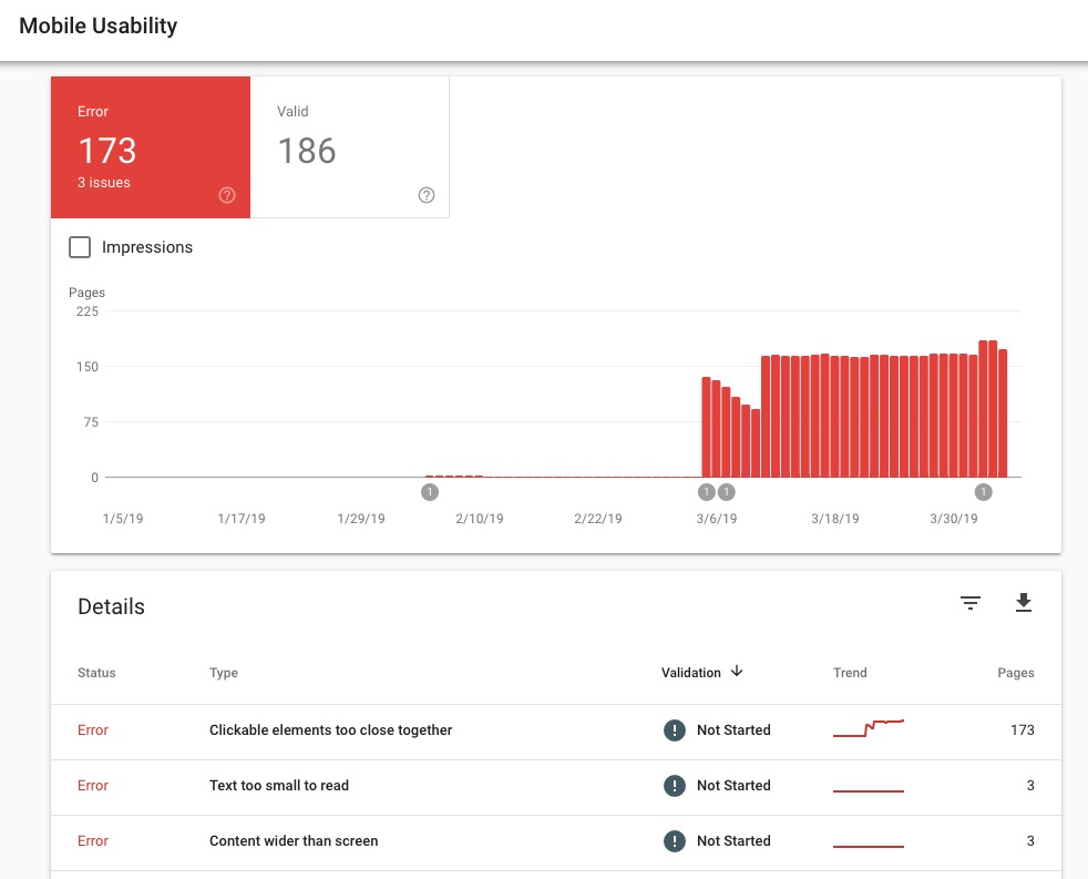
That was before I started working on fixing issues.
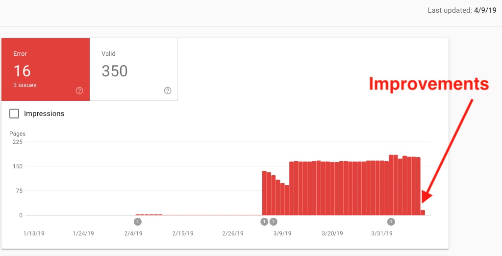
This is after I spent several days working on resolving problems.
I have requested that Google review my site. Their review stopped when they discovered a remaining problem on one of the pages. But they've cleared the vast majority of the issues, leaving only 16 to be cleared.
BTW - this site, TechSparx.com, is also being dinged for similar issues but the traffic hasn't been affected as much. The updates I'm about to report on have been made to TechSparx as well as the other site.
Fixing mobile-responsive issues reported by Google search console
I first scanned the pages that Google said had issues. Google did not give details but gave me three buckets to work with: a) Text too small to read, b) Clickable elements too close together, and c) Content wider than screen.
Tag Cloud I was oh so very proud of myself to figure out how to implement a Tag Cloud in AkashaCMS, the software with which TechSparx and the other site uses. But the Tag Cloud implementation resulted in lots of small text too close together to be usable on a mobile device. Tag Clouds were cool in 2005, but not so cool today. I've now dropped the Tag Clouds from both sites.
Look close at the top of this article, and you'll see some links - Category Names - that go to autogenerated pages listing other articles with the same categories. I'll leave all that in place, because it is useful to have these category pages.
Massive navigation menu did not work well on Mobile On this other site are several areas implemented as an "online e-book". The content is structured so I can use AkashaEPUB to generate an EPUB document from the same content on the website. That means there is a Table of Contents for each of those sections, and it made sense to use the Table of Contents as a navigation menu.
The problem was that for mobile devices the Table of Contents did not fit well in the screen. In the Safari browser on my iPhone the menu shrank itself to fit into the screen, which made the text of the menu way too small to read, and made for clickable elements that were too close together.
Most of the work was spent on analyzing a different way to present the Table of Contents, and then learning how to make a scrollable Bootstrap dropdown. See How to build scrollable dropdown menu in Bootstrap v4 when it must hold dozens of choices
URL's presented as text too wide for the screen In most cases of text too wide for the screen, this turned out to be URL's in the text which did not wrap properly on a small screen. It seems that Safari only wraps text on a - character and not a / character. Therefore on mobile-Safari this text did not wrap, and instead Safari shrank it so the entire text would fit on the screen, and that made the text too small to read.
I spent a lot of time studying the pages reported by Google, finding these URL's and rewriting them so they would wrap properly on the screen.
Tables too wide for the screen Similarly there were HTML tables that did not shrink well on the mobile screen. I redid some of those tables so they would fit better.
Result of fixing these mobile-responsive issues
All those were issues I should have detected on my own. Mostly they made the site unusable on mobile screens. I know better, and now I'm paying the price. Hopefully by taking action Google will look kindly again on my sites.
These sites contain informative content that I am creating to help as many people as possible make good decisions about electric vehicles. To reach my goals I cannot just sit here and cry that Google is taking my traffic away. It wasn't my traffic as if I owned it, and to keep traffic flowing to the site I have to make sure it continues being relevant.
There is lots more content to write, and lots of editing/cleanup and upgrading to the content that's there.
The result of what I've done so far is indeterminate. Google has decreased the number of pages with reported problems. But traffic has not resumed climbing.
I am hoping that by cleaning up the content, Google will poof something and immediately restore this site to the search ranking it has had historically, and that therefore traffic would resume to the site. But that might be a vain hope, and instead it will be a long slow climb again.
Process of getting Google to review problems it reports to webmasters
It's worth documenting right now how the review process works.
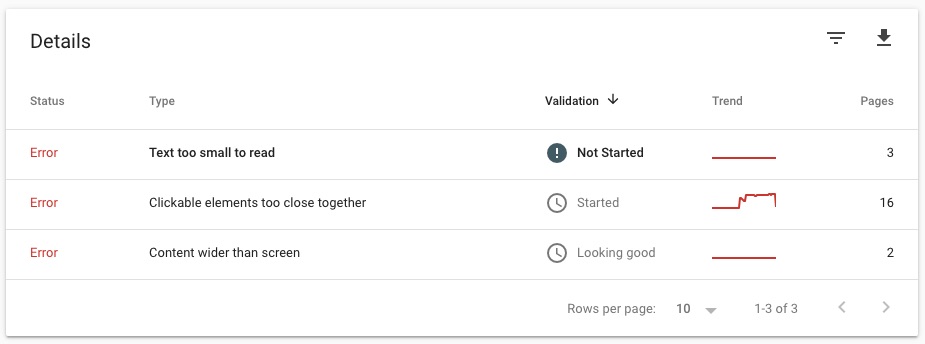
This summarizes the problems Google reported to me.
In one issue, Content too wide for screen, there were two reported pages and the status is Looking Good. This means Google completed the review and has cleared those two pages.
For Clickable elements too close together, there are 16 reported pages and the status is Started. This is where there had been 173 reported pages, and I had already requested a review.
For Text too small to read, there are 3 reported pages, and the status is Not started. I've fixed the problems on those pages, it's just that Google hasn't started the review.
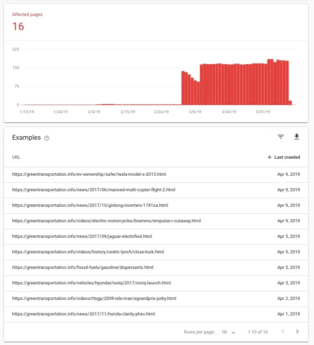
If you click on one of the rows you go to a details page that looks like this.
It shows the graph of the presence of this issue, and the affected URL's. What you do is visit each of the URL's and then scratch your head looking for how the problem phrase applies to that page. You then have to fix whatever you find.
Since Google does not give a precise report, the webmaster is left uncertain whether they've correctly identified the problem and have correctly fixed the problem that Google is actually reporting.
Once the webmaster believes they've fixed the problems, they should turn to the box above that report:

Initially this box has a button marked "Request Review". You click that button when you believe the mobile responsiveness issues have been fixed, and you want Google to take another look and possibly clear your site of reported problems. Since I have already fixed the problems, I have already clicked on this button and it instead reads "See Details".
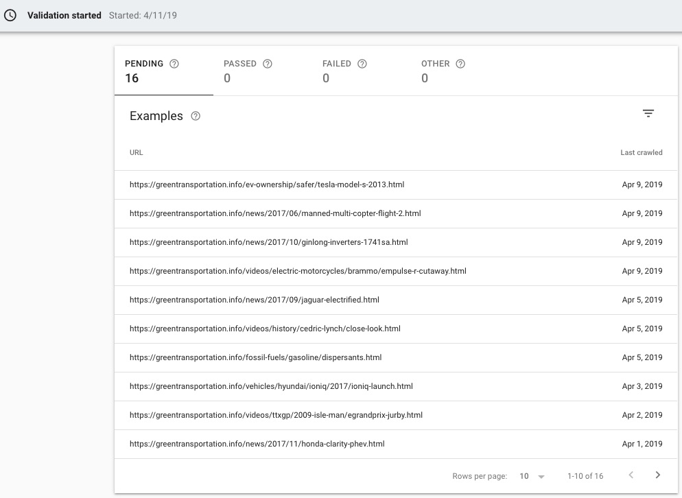
This is the Details page. It shows in this case when the Validation has started, the status of the validation process, and the status of each individual page.
Remember that for this list of URL's the review has not yet started. That's why it says all are in Pending state.


