David Herron
Tags: Bootstrap »»»»
The Bootstrap dropdown component is very easy to use, but doesn't work so well when it must contain a lot of content. In my case the dropdown contained the Table of Contents for a book with lots of ToC entries, and it didn't even fit well on a large screen. On a small screen for a mobile device, it shrank into unusableness, and Google recently lodged a usability complaint against the site. After researching a ton of alternative designs, a simple solution appeared.
Over on my
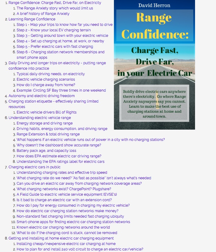
Green Transportation website, I have published several "online e-books" about electric vehicles and the like.
What I mean by "online e-book" is a group of content structured as if it is an e-book, and that could be extracted from the site and packaged as an EPUB document. I have written software that allows taking the SAME content and publishing to BOTH a website and as an EPUB. So, an online e-book is a kind of thing where the same content can go to multiple destinations.
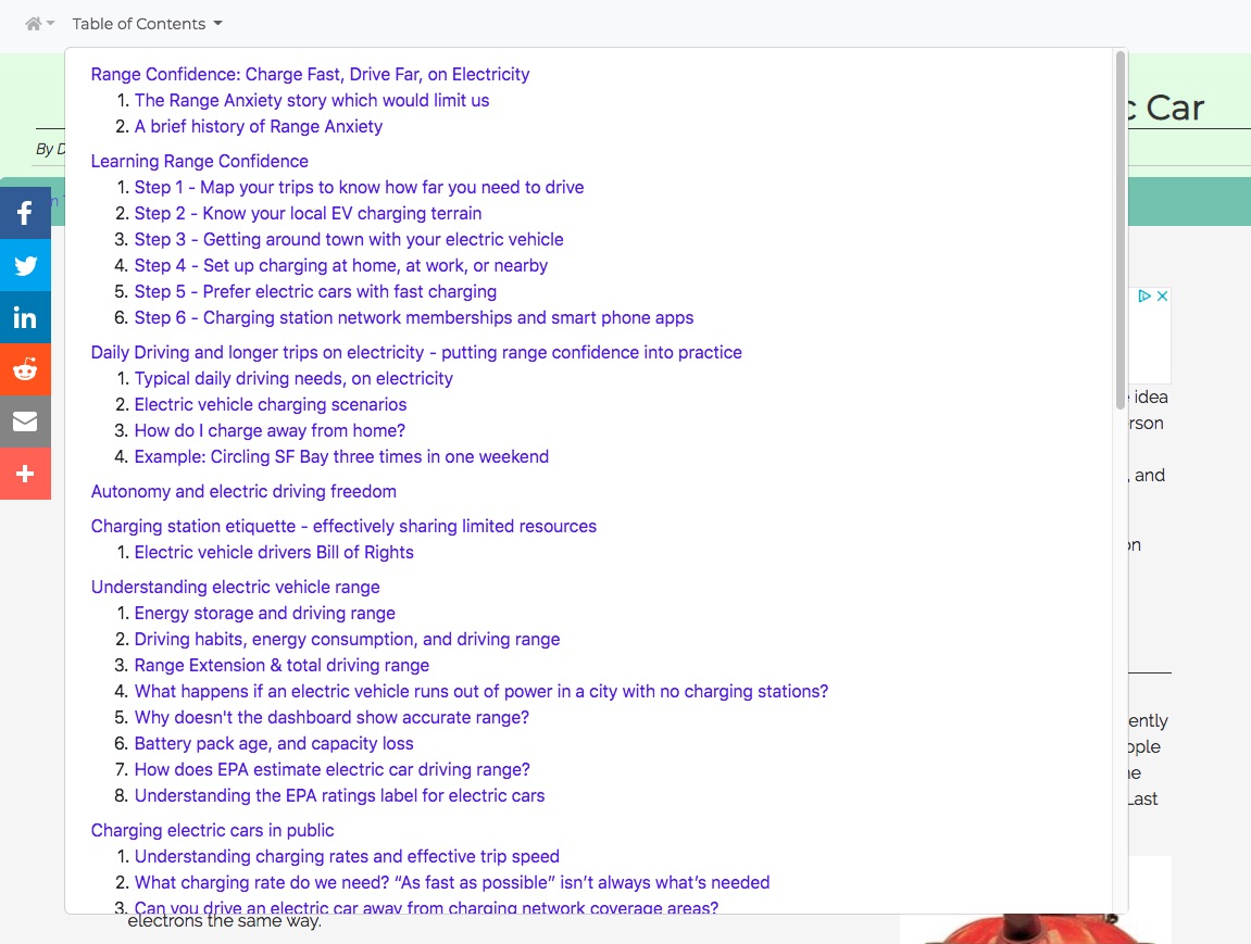
Here's a picture of the problem:
This is PART of the Table of Contents for this particular e-book. This particular page is the front page of the e-book. Every page inside the e-book was designed to have a dropdown with the same Table of Contents so the reader can quickly go to any other page in the e-book.
Consider -- this list is only 1/2 or so of the Table of Contents. To show this much on the screen, I had to zoom the browser to about 65%. And this ToC had to be displayed in a Bootstrap Dropdown to aid the user in navigating the site. This design seemed okay on my desktop screen, but it has a 24" display etc. As Google pointed out to me, with an SEO downranking because the site was not mobile-friendly, the design was unusable on mobile.
I considering some options: For example, could I implement a ToC sidebar? On the Bootstrap website they have an interesting sidebar for navigating pages, and it collapses to a dropdown. I almost figured out how to implement that behavior, but realized the Table of Contents was too large for a sidebar, and the dropdown for mobile would only repeat the same usability failure that Google dinged.
I came away with greater appreciation for web UI designs with multiple scrollable sections.
Bottom line is that a sidebar in this case would not work since the ToC entries are wide, being chapter and section titles.
I decided upon implementing a custom Bootstrap navbar fixed to the top of online e-book pages that would contain the Table of Contents for the given e-book.
Specifically:
<nav class="navbar navbar-expand-lg navbar-light fixed-top bg-light d-print-none">
    <button class="navbar-toggler" type="button" data-toggle="collapse"
            data-target="#ebookNavbarContent" aria-controls="ebookNavbarContent"
            aria-expanded="false" aria-label="Toggle navigation">
        <span class="navbar-toggler-icon"></span>
    </button>
    <div class="collapse navbar-collapse" id="ebookNavbarContent">
        <ul class="navbar-nav mr-auto">
            <li class="nav-item dropdown">
                <a class="nav-link dropdown-toggle" href="#" id="ebookNavbarAkashaCMSdropdown"
                        role="button" data-toggle="dropdown" aria-haspopup="true" aria-expanded="false">
                <i class="fas fa-home">
                </a>
                <div class="dropdown-menu" aria-labelledby="ebookNavbarAkashaCMSdropdown">
                    <a class="dropdown-item" href="/index.html">Green Transportation .info</a>
                    <a class="dropdown-item" href="/ev-charging/toc.html">EV Charging Guide</a>
                    <a class="dropdown-item" href="/fossil-fuels/toc.html">Fossil Fuels Guide</a>
                    <a class="dropdown-item" href="/energy-transportation/index.html">Energy/Transportation</a>
                    <a class="dropdown-item" href="/ev-history/1920s/ev-handbook-cushing/index.html">Historical EV Guide</a>
                    <a class="dropdown-item" href="/about.html">About</a>
                </div>
            </li>
            <li class="nav-item dropdown">
                <a class="nav-link dropdown-toggle" href="#" id="ebookNavbarToCdropdown"
                        role="button" data-toggle="dropdown" aria-haspopup="true" aria-expanded="false">
                Table of Contents
                </a>
                <ebook-toc-menu id="ebook-toc-ol" data-classes='[ "dropdown-menu" ]'
                    data-style="height: calc(100vh - 5em); overflow-y: auto;"
                    data-olliclasses='[ "dropdown-item" ]'
                    data-ollabeledby='ebookNavbarToCdropdown'></ebook-toc-menu>
            </li>
        </ul>
    </div>
</nav>
Most of this is a bog-standard Bootstrap v4 navbar with a dropdown menu. There are two dropdowns here, one to go to various sections of the Green Transportation website, the other containing the Table of Contents. The ToC is implemented using the custom AkashaCMS tag, ebook-toc-menu. It fetches the ToC of the e-book, does some transformation, in this case adding classes and other markup so it works as a Bootstrap dropdown.
The initial result was still that the dropdown was too large and did not fit on the mobile device.
The key was adding this attribute: data-style="height: calc(100vh - 5em); overflow-y: auto;"
The ebook-toc-menu custom tag applies that as an attribute to the root of the ToC: style="height: calc(100vh - 5em); overflow-y: auto;"
If you know CSS ... this does two things:
- It sets the height of the dropdown to be 5em's less than the full size of the screen.
- It makes the dropdown scrollable in the Y axis.
At the end of this we have a simple solution. To make a Bootstrap dropdown scrollable do two things with custom CSS:
- Set the height of the markup which drops down as desired
- Set
overflow-y: autoon the markup which drops down.