David Herron
Tags: YouTube »»»»
Did your YouTube home page recently switch to a horrible mode with large thumbnails that look like they're designed for old people with weak eyes? You probably didn't accidentally change a setting. Instead, YouTube (like any large web property) is always experimenting with user interface tweaks, and you probably got selected to be a test subject. In fact, you actually have been selected for an experiment, and you cannot "opt out" of that experiment according to a YouTube engineer. If you're like me, you hate this new design and are looking for an escape.
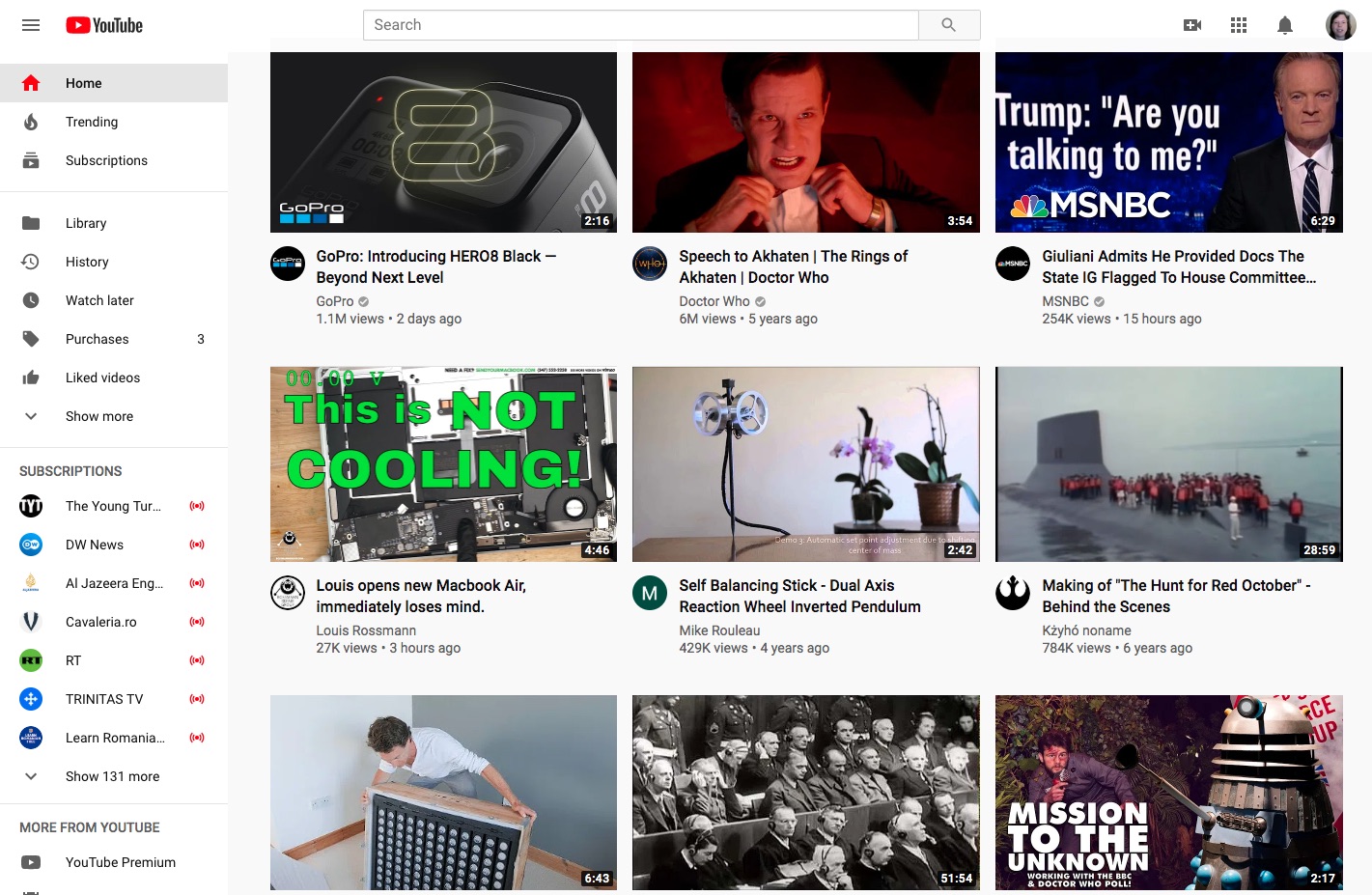
The image here is how my YouTube home page UI currently looks. For reference, this screen capture was taken on a 24" display with the browser window resized to take most of the display. The dimensions are 1421x927, therefore this "three across" layout means the YouTube video thumbnails are enormous. As if that's not bad enough, this lacks a feature I really like about the YouTube home page and that is organizing the suggested videos into categories.
When the YouTube home page is organized in categories, I find it much easier to understand which suggested video is (or is not) worth watching.
And if YouTube discerns that I'm interested in a topic like Mongolian Cat Herding, I can easily dismiss the whole topic. To dismiss a whole topic, there is an "X" in the upper-right corner of the topic rectangle. Click on that "X" and YouTube will hide it, and presumably YouTube's AI algorithms will learn more about your preferences.
With this new layout
- The videos are not contextualized within a topic or category
- The video thumbnails are way too large
- Resizing the browser window does not show more thumbnails, instead the thumbnails become even huger
To explain what I mean, I opened an Incognito Window to view the YouTube home page in its normal mode:
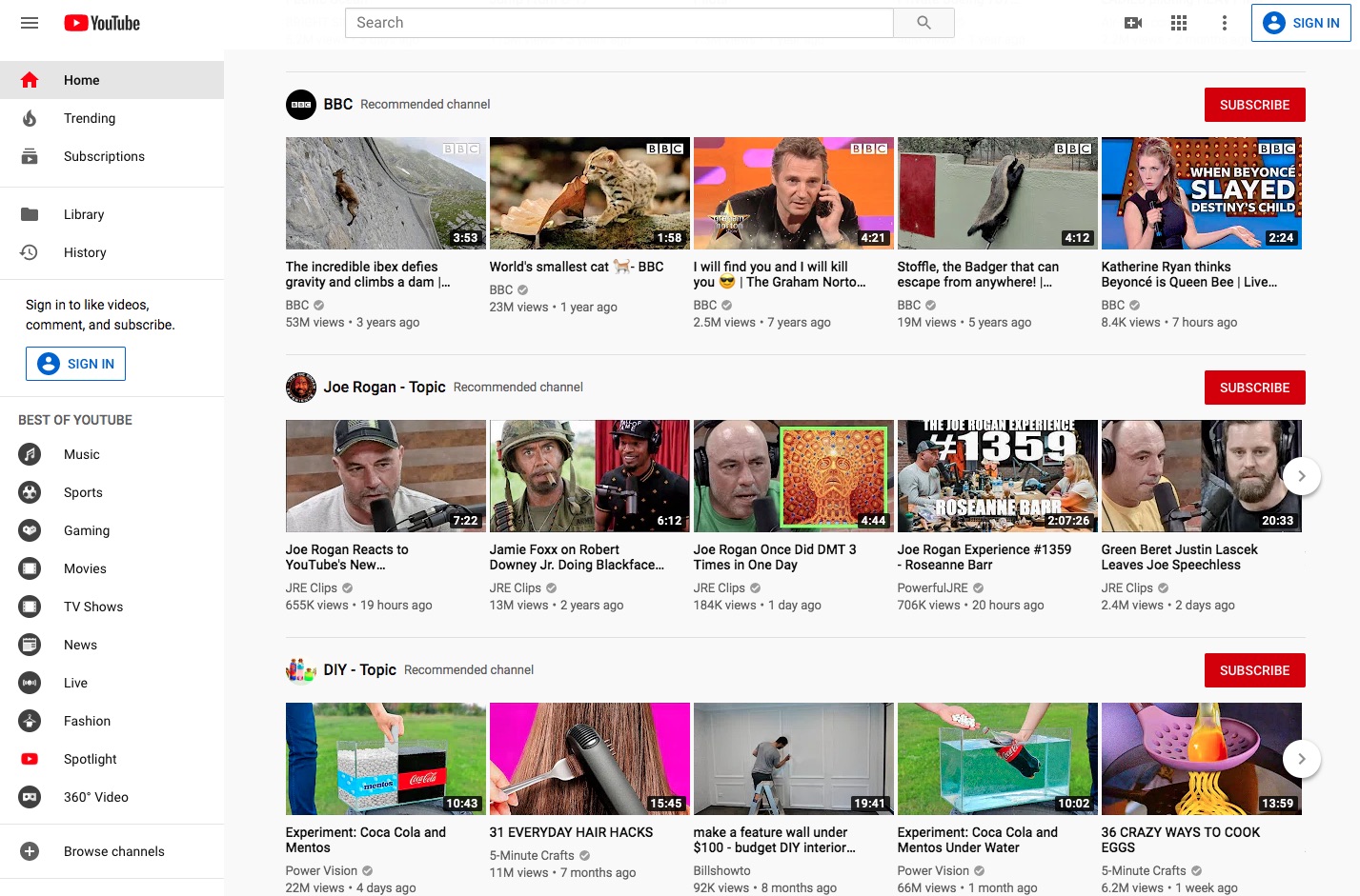
The topic name tells me each video falls into a given topic/bucket.
There is a convenient Subscribe button in case I'm interested in the topic. Or as I said earlier there is an "X" button to dismiss the topic.
YouTube helpfully explains why it thinks that topic might be of interest.
Switching back to the normal YouTube home page experience.
Because incognito mode gives us the normal YouTube home page, that's a clue we can follow.
I first tried clearing cookies for the youtube.com domain. No difference.
Logging out and logging back in also made no difference.
But, switching to another YouTube account did show the home page in this mode. I have several YouTube accounts by dint of having several Google accounts. The menu in the upper-right corner lets you switch between accounts, and therefore switching to another account shows the normal YouTube home page.
That gives one possible solution - simply switch to a new YouTube account. The problem is that after several months or years of using a YouTube account, there is a lot of history between you and that account. It's almost like having an relationship with a thing - because the suggestions given by a YouTube account are generated by artificial intelligence algorithms. I am accustomed to the suggestions given by that account, and it's more than just replicating the subscriptions from the old account into the new account. It's that this account knows that N years ago I watched a given video, and it occasionally brings that video up again as a "Watch This Again" suggestion.
After a lot of searching, I found a solution - Visit this URL:
https://www.youtube.com/?disable_polymer=1
Polymer is a Google-developed open source framework for web UI goodness. At least that's what the Polymer project claims. It design ethos is rooted the mobile first paradigm, and I believe this horrid new YouTube home page design is a mobile first user experience.
But you don't need to bang your head against what all that means. If you dislike the new YouTube home page user experience as much as I do, it seems that flag on the URL is an easy way to revert to the old style.
The next step is - if you like this UI - to drag that link to your bookmarks bar, then train yourself to click on that link. Hopefully YouTube's engineers will get the clue that we do not like this poor excuse of a YouTube home page.
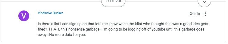
I'll end this post with an exchange found on
Google's YouTube Help area:
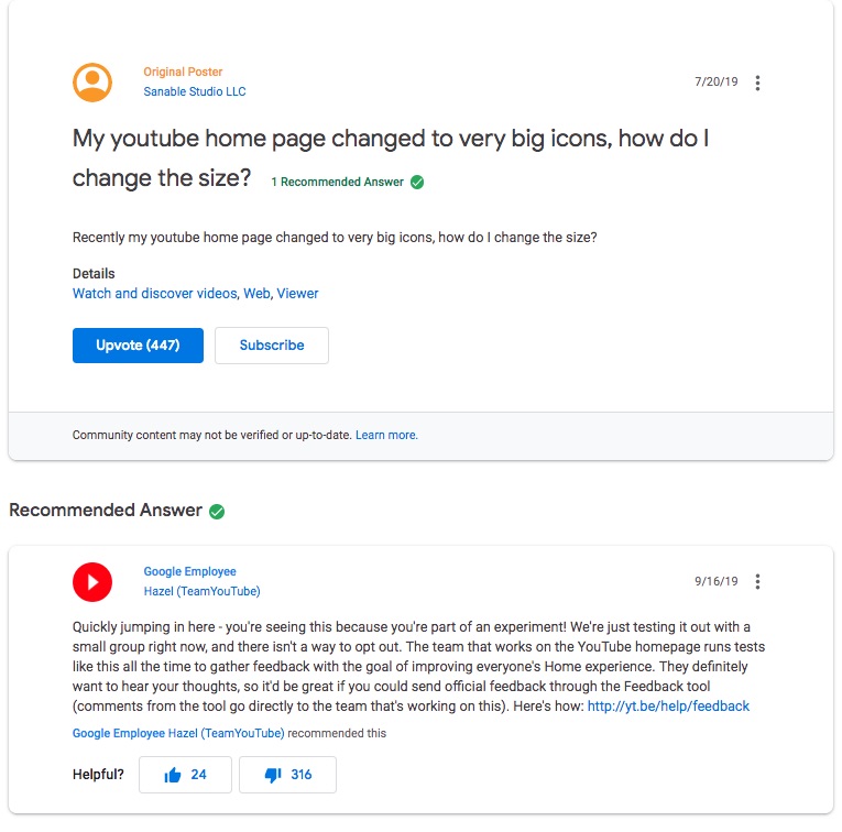
I find that to be an incredibly rude answer. We who got this new YouTube home page are part of an experiment and we cannot opt out.
There are 176 replies the majority of which are expressing dislike. The last one at the time I read this said:
Amen Brother!


")