Tags: Mobile-friendly web design »»»» Mobile accessibility »»»» Search ranking »»»» Search Engine Optimization
In April I noticed a sudden drop-off in traffic to one of my sites which was coupled with a Google notification that the site in question had mobile responsiveness issues. After a couple months of work the mobile responsiveness issues have been fixed to Google's satisfaction, but traffic to the site has not rebounded. The site is full of very important content that I believe could make a positive difference in the world, and my goal is getting the traffic to return.
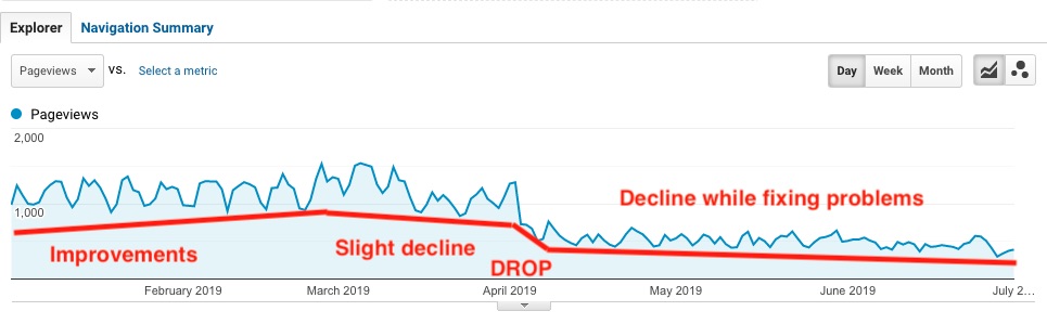
The image shows traffic as reported by Google Analytics from January 1 to July 1, 2019. Earlier I showed this image:
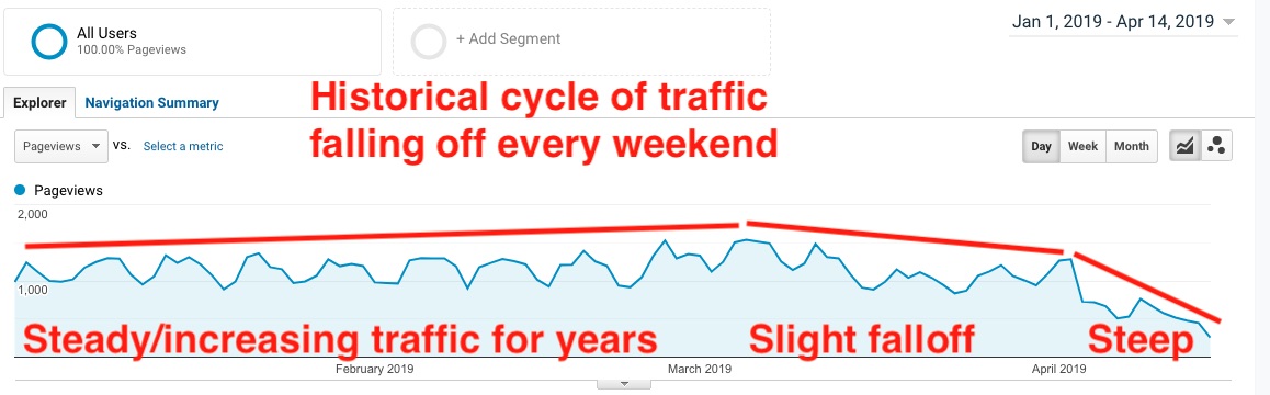
Until March and April 2019, traffic to this site had been steadily increasing. But as can be seen here there was a slight decline during March, and a steep decline in April. Earlier reports in this series have more details:
- Google starting to enforce mobile-friendly web design as a search ranking factor
- Intermediate result fixing mobile usability problems after Google enforced mobile-friendly web design as a search ranking factor
There is a history of Google warning website owners that mobile responsiveness issues could see a website penalized in Google search results. Specifically, Google is starting to index the mobile version of sites first where historically it was the desktop version of sites which got indexed. The site in question was not well designed for mobile, unfortunately.
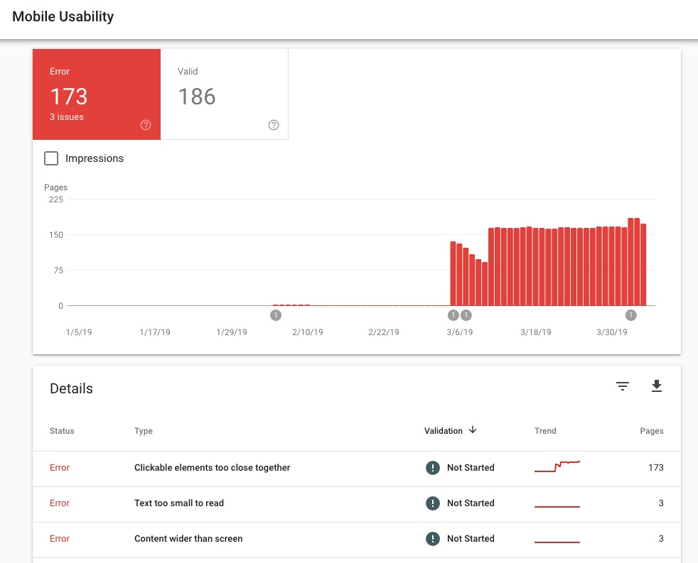
I noticed this at the time, that the beginning of the slight decline corresponded to a large increase in reported mobile responsiveness issues.
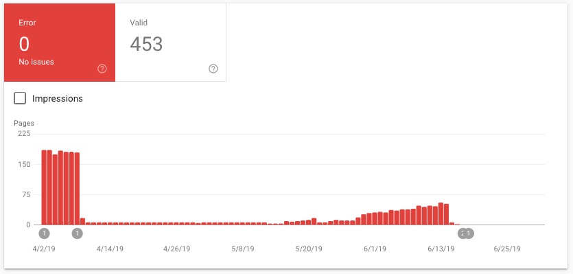
Fast forward 2 months and you can see that I fixed most of the mobile responsiveness issues pretty quick. But, I had ongoing issues to work on. Then about 3 weeks ago the number of issues started creeping up again.
What I finally did is a complete redesign so that mobile works very well as does desktop. As a result the mobile responsiveness report for this site has been clean for 2 weeks.
Some of the types of issues that came up:
- Text too wide for screen Most of the time this was due to long URL's having been put in the text. In some web browsers the long URL's would not wrap on a mobile browser. Instead the viewport would widen, meaning the text portion of the page would still wrap correctly but the URL would stick way outside the text area. For that to fit into the browser window, everything would shrink down to unreadability.
- Images too wide for screen A similar problem occurred on some pages where images were not properly scaled to fit the page. In both cases on some browsers the wide element, whether it's an image or a URL, would simply cut off or wrap, and on other browsers it would make the page content shrink so that the ultra-wide element would also fit on the screen.
- Navigation buttons too close together Obviously on a mobile device any tappable targets need to be far enough apart so that a fat finger won't hit the wrong target. Some examples:
- Breadcrumb items had to be spread far enough apart
- Advertising blocks needed padding-top and padding-bottom
- In the blog area, a pair of links for "Next article" and "Previous article" had to be redesigned to work well on Mobile
- The tag cloud - I was so proud of having developed tagcloud support - had to go away because the tag elements were too close together
- Popup navigation menu On that site there are areas which are eBooks sitting on the site. The eBooks contain a Table of Contents, and the ToC is represented on each page as a dropdown menu containing links to the pages in the ToC. While this dropdown menu worked well on desktop computers it did not work well on mobile, and that took some redesign.
Current work to restore traffic on that site
The mobile responsiveness issues are resolved. I've also begun a round of edits to the content. What I noticed is many of the pages were not so well written. Either there was an unclear topic, or too many tangential distractions in the text. The search engines obviously are analyzing the text of web pages to see what the page is about, to know which users to send to what website.
I'm working on cleaning up the text, refocusing every page onto clear topics, and making sure the text answers common questions so that the text is useful to the readers.


